
Like the post title says, this is a tutorial of sorts for a freezer paper transfer and for homemade chalk paint...try these techniques at your own risk...read on and you'll see what I mean.
Here's Part One of a recent 'inspired' project:


This started out as a dark wooden wall box thingee. I sanded it down (along with some cheese plates - that's another post), ready for some paint.
I tried my hand at some homemade chalk paint - three shades of it: cream, lilac, and yellow. Since I'm
One tip that seems to work well is to dissolve the baking soda in water before adding it to the paint - it makes the paint smoother, but still has the same sanding properties. Anyway, back to the box thingee...
 |
| Painting like crazy on one of the last warmish days in Michigan! |
See that yellow thing on top of the paint can/on top of the box/on top of the table? Well, that's the painted box. Painted with some buttery yellow oops paint (thank you Home Depot! Oh, and this post isn't sponsored by HD - I just end up there every other day, but I digress, as usual). Which was made into homemade chalk paint. Which was painted over a lovely lilac homemade chalk paint. So the lilac would peek through after distressing. Except for one thing...
After sanding the lovely, buttery yellow...it turned into a horrible, putrid chartreuse color. It truly was awful and thanks to the magic of paint, it was quickly repainted back to lilac. Whew!
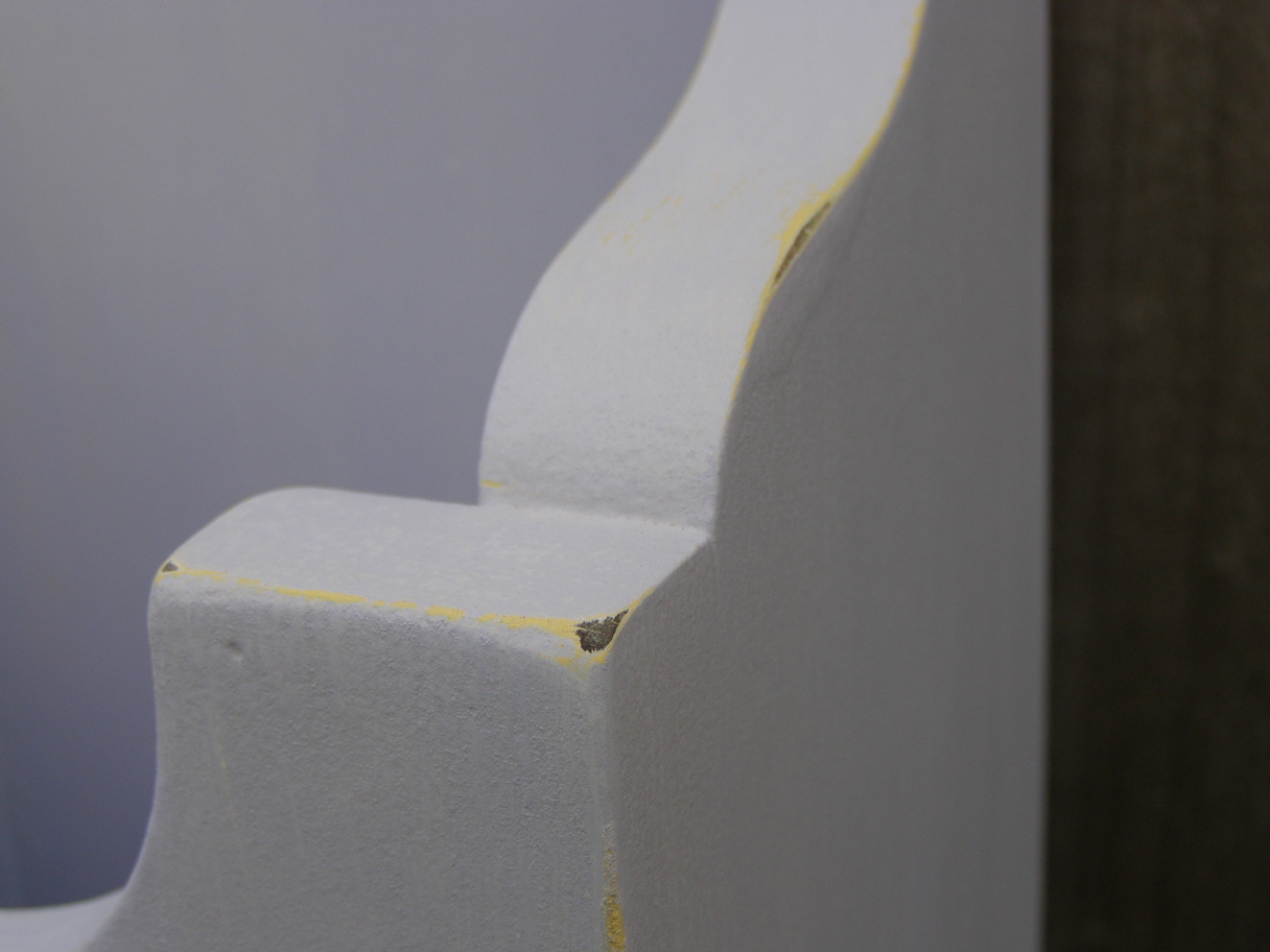

With distressing, the yellow shows a little but isn't obnoxious. But the box needed something...
Part Two of this post:
One thing that I'm always on the look out for is a good transfer method. Overhead projectors, carbon paper, homemade carbon paper, citra-solve - there are many methods out there and I've tried a few with ok results.
That's why I was excited when I read about a method using freezer paper and an inkjet - both of those things I already had! I used freezer paper for my curbside table stencil and it worked ok, but this was for a transfer of a detailed image.

Wreath image compliments of The Graphics Fairy. I added the text on Picnik.
I read the directions: adhere freezer paper waxy side out to a sheet of paper. Print out your image, place it where it's to be transferred, burnish with a spoon, and instant detailed image. Easy, right?
Well, late at night is not the time to be trying new projects.
- I forgot to mirror the image with the text; fail.
- I didn't use spray adhesive to glue the freezer paper to the regular paper (the first time); fail.
- I thought I remembered the directions, but forgot about dampening the wood before placing the image on it; fail.
- I was able to wipe off the backwards text, properly adhere the freezer paper with spray adhesive, print out new text, dampen the wood...and smeared it completely; fail.
Part Three:
After a few days of not thinking about this at all, it was time to try again. I almost gave up and stenciled the project, but
Image of properly adhered freezer paper, with a properly mirrored image:
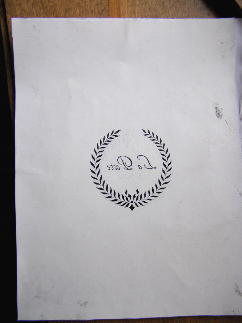 |
| You can see that this paper has been through the printer a few times because of my mistakes...it wipes off, but leaves a ghosted image. Seems to be fine though. |
Now it's very important to not move the image around or you'll get a smeary image. Trust me on this one (see above...way above...like in Part Two of this obnoxiously long post...).
Here is the transferred image:
 |
| With dampening, the image turned out much darker than my first try. |
 |
| It smeared just a little in spots, but a dampened q-tip cleaned up those areas. |
 |
| Best shot on a cloudy day - sorry it's tilted, but this is the only way I could get the whole box in the light. |


And see that picture of my and my hubs? It's a pretty funny story about how that all happened...maybe I'll tell ya sometime.
Here are a couple of thoughts on the transfer method and homemade chalk paint:
- Mixing the baking soda with water before adding the paint makes the paint much smoother, but doesn't affect the chalky qualities of the paint. I did try it without dissolving the baking soda in water first, and the paint was very thick and lumpy. Makes for more sanding. Just sayin.
- Putting the image on a transparency would've been a good idea for placement - will try that next time...and no sticky mess with spray adhesive - bonus!
- Dampen where you need to transfer, but be careful not to get it too wet or the ink will just smear.
- Putting the transfer onto chalk paint doesn't leave a perfect transfer because chalk paint is a bit textured to begin with; transferring to a smooth surface would leave a better impression. If you're going for a distressed, old-ish look anyway, then transferring onto chalk paint is fine.
- Make sure you let the transferred image DRY before touching it!!
- Make sure you don't seal it with anything water-soluable or it will smear!! Use an oil-based sealer and test it on another piece first just in case.
Knick of Time Tuesday Party
Boogie Board Cottage Masterpiece Monday
The Idea Room
A Picture is Worth 1,000 Words 2nd Time Around
Blue Cricket Design's Show and Tell


