Design distraction anyone? Like I don't have enough going on, I decided to try stamping. There are so many cute designs out there and I wanted to make some myself.
I bought a stamping set of letters/numbers/basic symbols to start with. The nail set is for a 'period' symbol. The square metal thingee is called an anvil and is what you stamp the piece on. A hammer is used to strike the top of the stamp, making a depression of the symbol on what's being stamped. It takes a pretty good hit, so the anvil protects the desk.
Since experience has taught me to not use the most expensive materials to practice a new skill, I bought some washers to try this out on. Turns out that was a good idea. These are, from left to right, my first, second, and third tries at this project. Spacing is obviously as important as positioning. Oh, and getting the letter going the right way...
 |
| The 'D' in pride on the left stamp is backwards |
The stamps are held perpendicular to the piece to be stamped and hit with a hammer (once if you're good, more than once if you don't think it came out deep enough.)
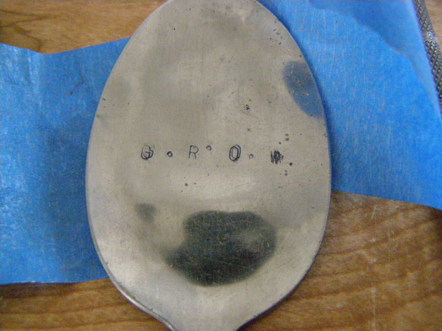
A piece of painter's tape holds the piece on the anvil while it's being stamped. It also helps line up the stamps if stamping in a straight line.
Longer words = harder positioning = more skill needed ;)
This was a 'try-it-and-see' on the back of one of the earlier mistakes. It's a definite maybe.
The finished project. I added a 1mm black cotton cord, and a couple of charms. My sister loved hers, and my sister-in-law's is in the mail (hope she doesn't read this before she gets it!)
PS: Forgot to add: to get the letters to stand out more, I used a black marker pen - it wipes off easily from the metal but stays in the stamped letters. Just in case anyone is thinking of attempting this themselves!